Are your fundraising appeal letters easy to read? If not, all the work you put into choosing the right words may be wasted. (As in, tossed into the trash, unread.)
Let’s say you’ve done what it takes to persuade your potential donor to open the envelope. You’ve called them by the name they like to be called by, and you’ve written a P.S. that makes them want to go back and read your message. You’ve even included some excellent photos that go a long way toward telling the story.
And then they look at the language of your appeal letter, and it’s a solid wall of text. Into the trash it goes! (If they’re conscientious, into the recycling!)
What You Can Do to Make Letters Easy to Read
White space
 Before & After Magazine’s John McWade describes white space as no less than a “zone of silence”–and that’s a good thing!
White space gives your readers a break from the printed word, allowing them to rest their eyes, and making them more likely to continue reading. (And that’s what you want, right?)
Lisa Sargent gives five easy and powerful ways to use white space in your fundraising appeals:
- Use reasonable page margins (at least one inch, right and left).
- Write short, indented paragraphs and leave a blank line between them.
- Leave plenty of space for your signature.
- For longer letters, use subheads.
- Indent quotations.
Font
Why should you care about something seemingly trivial like the font your letter is printed in? Well, Colin Wheildon, author of Type & Layout: Are You Communicating or Just Making Pretty Shapes?, says:
It’s possible to blow away three-quarters of our readers simply by choosing the wrong [font]. If you rely on words to sell, that should concern you deeply.
Kathie Kramer Ryan of Arroyo Fundraising Fluency advises:
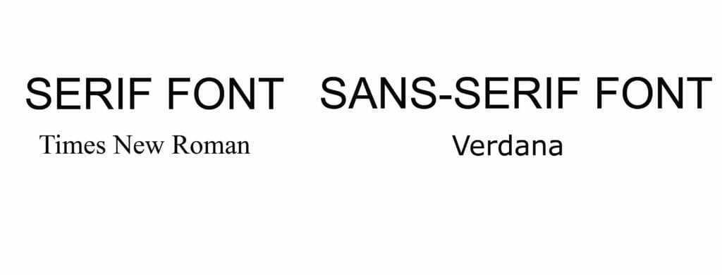
- Use serif font for print and sans serif for online.
- Use at least 12-point font for older eyes. (I would say 14!)
- Don’t let designers dictate the look of your fundraising letter. Choose a font that invites your audience in.
 Underlining, bold, and italics
The late, legendary fundraiser Mal Warwick counsels you:
Let’s assume you’ve decided that subheads are inappropriate for the appeal you’re writing… There’s still an easy way for you to accent the benefits offered in your appeal, answer readers’ unspoken questions, and make your letter easier to read: by underlining. Do it sparingly. Choose only a few key words and phrases. But, if possible, choose them before you write the body of the letter!
Why should you choose the words to emphasize even before you write the letter?
Because it helps you decide what the letter is really about.
Because it helps you remember what the letter is really about.
Because it helps you communicate what the letter is really about to your donors–and it forces you to ask, “And why does that matter to the person I’m asking to give?”
You should pay attention to white space, font size and shape, underlining, bold, and italics for the same reason you pay attention to your donors. Share on XBy making your appeal letters easy to read, you show them you care–and make it easy for them to see why they should give.

