Communicate!

Helping you win loyal friends through your communications

Navigation Bar

  • About
  • Services
  • What Clients Say
  • Contact

Fundraising Tuesday: The Money is in the Mail

September 22, 2020 by Dennis Fischman Leave a Comment

Cat waiting for mailAre you thinking of giving up on fundraising by mail? Don’t.

Direct mail is still the most productive way of asking for donations to your nonprofit organization. If you give up on direct mail, it’s like throwing money in the trash.

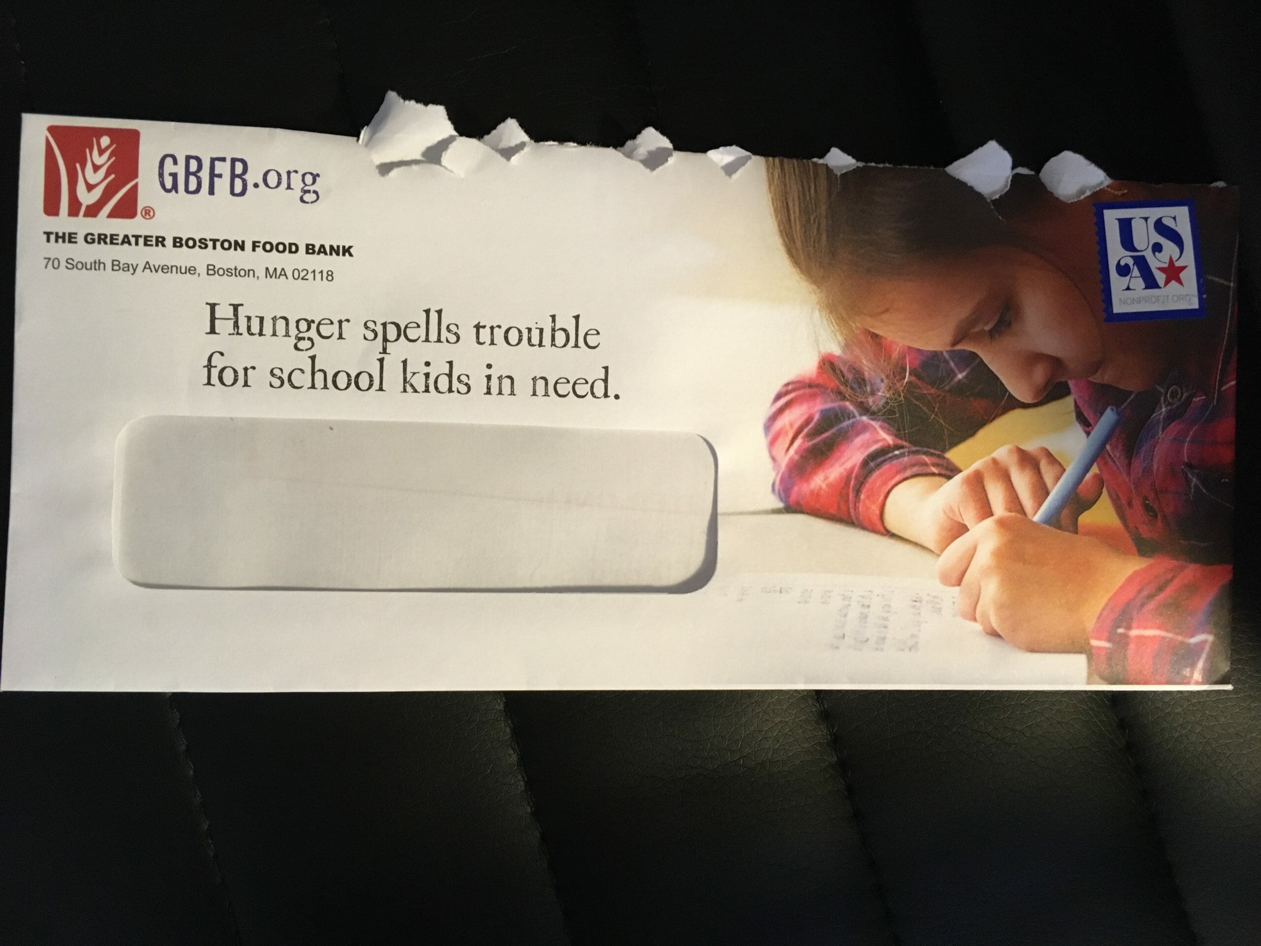
Sending a good fundraising appeal by mail beats asking for money by email, by text, or by social media. In fact, a lot of the time, when a generous donor gives to your organization online, they saw your appeal letter first!

Why wouldn’t you send your appeal by mail?

  • “It costs too much.” Not when the return on your investment is so great! Those stamps and envelopes will more than pay for themselves when a larger number of donors send you a larger amount of money.
  • “We don’t know how to write a good letter.” You can get all the advice you need to write the ideal appeal letter from this blog. Or, you can pay me to do it for you!
  • “Our mailing list is out of date.” No time like the present to update it! And if your list is on a database or constituent relationship management system (CRM), the tool may check the National Change of Address database for you.
  • “We don’t trust the post office.” In 2020, that is a real concern, but it’s all the more reason to send out your mail early.

The only real problem that might prevent you from using the mail is this: “We haven’t collected our supporters’ mailing addresses.” Now, there’s a problem, and one you can start to fix right away.

Ask yourself, What do we have to share, or what can we produce to share, that will be so valuable to the donors that they will be willing to give us their mailing addresses? Share on X

Is it a fact sheet about the issue they care most about?

Is it a bumper sticker (design and printing donated by another of your supporters)?

Is it artwork by children in your program? Or free admission to an online program? Is it a gift certificate for a store that supports your mission and likes to make its support known, to reach potential customers?

Give the audience something that makes them glad to share their address. Then, send them a newsletter. Follow it up with an appeal letter, and follow that up by email, social media, and phone.

When they give, make sure you do more than send an auto-acknowledgment, more than an email welcome series.

Send them the ideal thank-you letter. In the mail.

Share this:

  • Click to share on Facebook (Opens in new window) Facebook
  • Click to share on X (Opens in new window) X
  • Click to email a link to a friend (Opens in new window) Email
  • Click to share on Pocket (Opens in new window) Pocket
  • Click to share on WhatsApp (Opens in new window) WhatsApp
  • Click to share on Pinterest (Opens in new window) Pinterest
  • Click to share on LinkedIn (Opens in new window) LinkedIn
  • Click to print (Opens in new window) Print

Fundraising Tuesday: Fail and Fab Appeal Letters

August 18, 2020 by Dennis Fischman Leave a Comment

I love to see all the appeal letters you are sending to my wife and me. It shows that nonprofits understand that donors want to make a difference, especially during a crisis! Just this summer, 18 appeal letters from 14 different organizations hit our mailbox.

But…

Not all appeal letters are created equal. Let me tell you about a fundraising fail and an absolutely fabulous appeal letter, both from good nonprofits. Share on X

Fail: Because Donors’ Names Matter

Doctors Without Borders does magnificent work, and Rona and I have supported them in the past. Their appeal letter was stuffed with good elements that should have made it a winner, including:

  1. A heartwarming story about one particular child
  2. Color photos of that child before and after being helped
  3. A card that doctors actually use to measure whether or not a child is malnourished–making the impact tangible
  4. A postscript that made the need to give more urgent
  5. Service to the donor in the form of a Covid-19 update and a newsletter
  6. A premium for the donor: a notepad with the organization’s logo on every page

When I say stuffed, I mean stuffed! It was a thick envelope.

So, what went wrong?

The less important fail was that the envelope was blank white, without even the name of the sender, let alone anything that would make us want to open it and see what’s inside. (Maybe they thought the sheer bulk would pique our curiosity.)

Wrong name

If you forget my name, I may soon forget yours

The key reason I consider this appeal letter a fail–and a missed opportunity–is how they handled the donor’s name.

Through the window envelope (which is already an impersonal package), we could see the message was addressed to “Rona J.S.” Yes, those are the correct middle initials. But why in the world would you leave off the last name?

Inside, the salutation of the letter was “Dear Friend.” How friendly is Rona going to feel when you get her name wrong on the outside and don’t use it at all on the inside (except on the donation slip, which she’s only going to see if she decides to give you money)?

You don’t know my name and you call me your friend? What do you think this is: Facebook? -Rona Fischman

Yes, the Fischmans may still give to Doctors Without Borders–but it will be in spite of their appeal letter, not because of it.

Please don’t make it harder for your donors to stay loyal. Get their names right.

Fab:

Greater Boston Food Bank envelope

The Greater Boston Food Bank starts getting it right with the envelope. The picture says without words, “back to school time for kids.” The text on the envelope tells you the problem–and because you’re looking at that child, you care.

Inside, they use a version of the same photo, with the caption:

When children are hungry, they can’t focus on studies. Together, we can help.

Usually I advise nonprofits to use more  “you” than “we” in their fundraising, to make the donor the hero of the story. Being self-centered instead of donor-centered is a classic way to fail at fundraising.

In this appeal letter, though, they’re using  “we” the right way: not we at the organization vs. you, the donor. We, meaning both of us together: the Fischmans and GBFB.

What else did this organization do well in its appeal letter?

They got Rona’s name right.

They told the story of a parent who’s worried about feeding his children.

They included a bookmark with a cute quotation form Dr. Seuss…and on the back, spaces to record “Ten Awesome Books I Read This Year.” (Because the donors may have children we love, and thinking about them will make us more likely to give.)

The takeaway?

You should shamelessly steal ideas from the Greater Boston Food Bank and other nonprofits who are raising a lot of money in the summer of this very strange year. You can make your appeal letters work so well, they’ll be…

Fabulous


Share this:

  • Click to share on Facebook (Opens in new window) Facebook
  • Click to share on X (Opens in new window) X
  • Click to email a link to a friend (Opens in new window) Email
  • Click to share on Pocket (Opens in new window) Pocket
  • Click to share on WhatsApp (Opens in new window) WhatsApp
  • Click to share on Pinterest (Opens in new window) Pinterest
  • Click to share on LinkedIn (Opens in new window) LinkedIn
  • Click to print (Opens in new window) Print

Fundraising Tuesday: Appeal Letters, Easy to Read

June 30, 2020 by Dennis Fischman Leave a Comment

wall-of-text

Are your fundraising appeal letters easy to read? If not, all the work you put into choosing the right words may be wasted. (As in, tossed into the trash, unread.)

Let’s say you’ve done what it takes to persuade your potential donor to open the envelope. You’ve called them by the name they like to be called by, and you’ve written a P.S. that makes them want to go back and read your message. You’ve even included some excellent photos that go a long way toward telling the story.

And then they look at the language of your appeal letter, and it’s a solid wall of text. Into the trash it goes! (If they’re conscientious, into the recycling!)

What You Can Do to Make Letters Easy to Read

White space

white spaceBefore & After Magazine’s John McWade describes white space as no less than a “zone of silence”–and that’s a good thing!

White space gives your readers a break from the printed word, allowing them to rest their eyes, and making them more likely to continue reading. (And that’s what you want, right?)

Lisa Sargent gives five easy and powerful ways to use white space in your fundraising appeals:

  1. Use reasonable page margins (at least one inch, right and left).
  2. Write short, indented paragraphs and leave a blank line between them.
  3. Leave plenty of space for your signature.
  4. For longer letters, use subheads.
  5. Indent quotations.

Font

Why should you care about something seemingly trivial like the font your letter is printed in? Well, Colin Wheildon, author of Type & Layout: Are You Communicating or Just Making Pretty Shapes?, says:

It’s possible to blow away three-quarters of our readers simply by choosing the wrong [font]. If you rely on words to sell, that should concern you deeply.

Kathie Kramer Ryan of Arroyo Fundraising Fluency advises:

  • Use serif font for print and sans serif for online.
  • Use at least 12-point font for older eyes. (I would say 14!)
  • Don’t let designers dictate the look of your fundraising letter. Choose a font that invites your audience in.

Serif and sans serif fontsUnderlining, bold, and italics

The late, legendary fundraiser Mal Warwick counsels you:

Let’s assume you’ve decided that subheads are inappropriate for the appeal you’re writing… There’s still an easy way for you to accent the benefits offered in your appeal, answer readers’ unspoken questions, and make your letter easier to read: by underlining. Do it sparingly. Choose only a few key words and phrases. But, if possible, choose them before you write the body of the letter!

Why should you choose the words to emphasize even before you write the letter?

Because it helps you decide what the letter is really about.

Because it helps you remember what the letter is really about.

Because it helps you communicate what the letter is really about to your donors–and it forces you to ask, “And why does that matter to the person I’m asking to give?”

You should pay attention to white space, font size and shape, underlining, bold, and italics for the same reason you pay attention to your donors. Share on X

By making your appeal letters easy to read, you show them you care–and make it easy for them to see why they should give.


Share this:

  • Click to share on Facebook (Opens in new window) Facebook
  • Click to share on X (Opens in new window) X
  • Click to email a link to a friend (Opens in new window) Email
  • Click to share on Pocket (Opens in new window) Pocket
  • Click to share on WhatsApp (Opens in new window) WhatsApp
  • Click to share on Pinterest (Opens in new window) Pinterest
  • Click to share on LinkedIn (Opens in new window) LinkedIn
  • Click to print (Opens in new window) Print
  • « Previous Page
  • 1
  • …
  • 3
  • 4
  • 5
  • 6
  • 7
  • …
  • 23
  • Next Page »

Yes, I’d like weekly email from Communicate!

Get more advice

Yes! Please send me tips from Communicate! Consulting.

Subscribe to Blog via Email

Enter your email address to subscribe to this blog and receive notifications of new posts by email.

Copyright © 2025 · The 411 Pro Theme on Genesis Framework · WordPress · Log in